Maps, line graphs, Venn diagrams, matrixes, and charts are common methods used to graphically visualize research-based data. Recently, data visualization has developed in several directions:
■ Theoretical
■ Methodological
■ New technological areas
Advances include the development of a grammar of graphics, deeper understanding of human perception and implications for graphical layout, better approaches to visualizing multidimensional data, and organizing large data sets.
Consider some of the ways one might map or visualize information related to furniture design. One can compare the relative strength of various glues or the relative cost to manufacture comparable chairs. One could diagram the global production centers and look at the exportation / importation values regarding furniture sales broken down by country and by year. One could look at the ads in specific journals and analyze the type or spatial context of the furniture shown within the ads. However the approach, researching furniture design involves the gathering, organizing, and analyzing of information, most of which can be gathered, ordered, synthesized, and presented through a variety of graphic techniques, which include:
■ Venn diagrams
■ Charts (pie, bar, graph)
■ Two – or four-axis models
■ Matrixes
■ Lexicons
Venn Diagrams
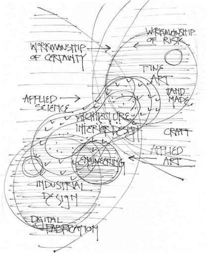
Venn diagrams indicate relationships between classifications and interrelated subsets drawn as simple, closed curvilinear shapes (Figure 1.20). As an example, consider a Venn diagram that graphically indicates the professional and disciplinary relations engaged in
|
Figure 1.20 Venn diagram indicating shared and dependent relations among the disciplines of Art, Industrial Design, Engineering, Architecture, and Interior Design. High technologies (workmanship of certainty) stem from the left side of the diagram, while lower technologies (workmanship of risk) stem from the right side. Diagram by Jim Postell, 2011. |
furniture design. Notice how the diagram sets a framework for the shared relationships and influences between the individual subsets by the size, location, and spatial relationships of the curvilinear shapes.


