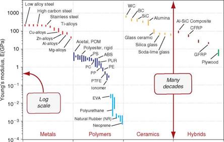
Data sheets like those of Chapter 12 list material properties, but they present no comparisons and they give no perspective. The way to achieve these is to plot material property charts.
Material property charts. Property charts are of two types: bar charts and bubble charts. A bar chart is simply a plot of the value ranges of one property. Figure 6.6 shows an example: it is a bar chart for Young’s modulus, E, the mechanical property that measures stiffness. The largest value is more than 10 million times greater than the smallest—many other properties have similarly large ranges—so it makes sense to plot them on logarithmic[24] scales (as here), not linear ones. The length of each bar shows the range of the property for each of the materials, here segregated by family. The differences between the families now become apparent. Metals and ceramics
|
|
|
|

have high moduli. Those of polymers are smaller by a factor of about 50 than those of metals. Those of elastomers are some 500 times smaller still.
More information is packed into the picture if two properties are plotted to give a bubble chart, as in Figure 6.7, here showing modulus E and density p. As before, the scales are logarithmic. Now families are more distinctly separated. Ceramics lie in the yellow envelope at the very top; they have moduli as high as 1000 GPa. Metals lie in the reddish zone near the top right; they, too, have high moduli, but they are heavy. Polymers lie in the dark blue envelope in the center, elastomers in the lighter blue envelope below, with moduli as low as 0.0001 GPa. Materials with a lower density than polymers are porous—manmade foams and natural cellular structures like wood and cork. Each family occupies a distinct, characteristic field. Yet more information can be displayed by using functions of properties—group – ings such as E/p or Hmp for the axes of the charts; examples appear later.
Material property charts are a core tool.[25]
■ They give an overview of the physical, mechanical, and functional properties of materials, presenting the information about them in an compact way.
■ They reveal aspects of the physical origins of properties, helpful in understanding the underlying science.
■ They become a tool for optimized selection of materials to meet given design requirements, and they help us understand the use of materials in existing products.
■ They allow the properties of new materials, such as those with nano or amorphous structures, to be displayed and compared with those of conventional materials, bringing out their novel characteristics and suggesting possible applications.
Property charts appear in the chapters that follow. Right now we use them to explore the ecodata.
Embodied energies of materials. Embodied energies of materials are compared in the bar charts of Figures 6.8 and 6.9. The first plots the energy
|
Embodied energy (MJ/m3) Embodied energy (MJ/kg) |
per unit mass (units: mJ/kg). Among metals, the light alloys based on aluminum, magnesium, and titanium have the highest values, approaching 1000 MJ/kg for titanium on this chart, but precious metals lie much higher still (Table 6.3). Polymers all cluster around 100 MJ/kg, less than the light alloys but considerably more than steels and cast irons, with energies between 20 MJ/kg and 40 MJ/kg. Technical ceramics such as aluminum nitride have high energies; those for glass, cement, brick, and concrete are much lower. Composites, too, have a wide spread. High-performance com – posites—here we think of carbon-fiber reinforced polymers (CFRPs) —lie at the top, well above most metals. At the other extreme, paper, plywood, and timber are comparable with the other materials of the construction industry.
But is embodied energy per unit mass the proper basis of comparison? Suppose, instead, the comparison is made per unit volume (see Figure 6.9). The picture changes. Now metals as a family lie above the others. Polymers cluster around a value that is lower than most metals; by this measure they are not the energy-hungry materials they are sometimes made out to be. The nonmetallic materials of construction—concrete, brick, wood—lie far below all of them. CFRP is now comparable with aluminum.
This raises an obvious question: if we are to choose materials with minimum embodied energy as an objective, what basis of comparison should we use? A mistaken choice invalidates the comparison, as we have just seen. The right answer is to compare energy per unit of function. We return to this topic, in depth, in later chapters.
Carbon footprint. Material production pumps enormous quantities of CO2 into the atmosphere; some 20% of the global total arises in this way. So it is interesting to ask: which materials contribute the most? That depends on the carbon footprint per kg and on the number of kgs per year that are produced. The data sheets have the information to explore this question. Figure 6.10 answers the question and illustrates how the data can be used. It was made by multiplying the annual world production by the carbon footprint for material production to give the tonnage of CO2 per material per year. The big four are iron and steel, aluminium, concrete (cement), and paper and cardboard. They account for much more than all the rest put together.
Water usage. Water usage is compared in Figure 6.11. Materials with high embodied energy tend to have high water usage—not surprising, given the water demands of energy listed in Table 2.2. There is not much else to be said except that the water consumptions plotted here are small compared with those required, per kg, for water-intensive agricultural crops such as rice and cotton or for materials derived from animal husbandry, such as wool.
о
FIGURE 6.10
V)
Ф
Zi
Ф
О)
FIGURE 6.11
Process energies. Process energies are plotted in Figure 6.12. Here it is necessary to remember the very limited and imprecise nature of the data. Vapor processing and powder methods stand out as energy intensive.
Recycling. Figure 6.13 presents the data for recycle fraction in current supply. As discussed in Chapter 4, the recycling of metals is highly developed
supply is large. The same cannot be said of polymers. The commodity polymers are used in large quantities, many in products with short life, and they present major problems in waste management, all of which, you would think, would encourage effective recycling. But the economics of polymer recycling are unattractive, with the result that their contribution to current supply is small.
6.6 Summary and conclusion
You can’t answer technical questions without numbers. "Choice X is worse than Choice Y…" is a statement that is on solid ground only if you have data to demonstrate that it is indeed so. Concern for the environment today sometimes leads to statements based more on emotion than reason, clouding issues and breeding deception. So, boring though numbers can be, they are essential for analysis based on fact, not on speculation.
To use numbers, you have to know what they mean and how accurate (or inaccurate) they are. This chapter introduced the ones used later in this book, presenting them as bar charts that display relationships and correlations. The numbers describe eco-attributes of materials, here principally those relating to energy and carbon footprint. The thing to remember about them is that their precision is low. If you are going to base decisions on their values, make sure that the decision still stands if the numbers are wrong by ±10%, or, better, ±20%. Such uncertainty does not prevent decision making, provided that its presence is recognized and allowed for.
7.1 and synopsis
An eco-audit is a fast initial assessment. It identifies the phase of life— material, manufacture, transport, use, disposal—that carries the highest demand for energy or creates the greatest burden of CO2. It points the finger, so to speak, identifying where the problems lie. Often, one phase of life is, in ecoterms, dominant, accounting for 80% or more of the energy and carbon totals. This difference is so large that the imprecision in the data and the ambiguities in the modeling, discussed in Chapter 3, are not an issue; the dominance remains even when the most extreme values are used. It then makes sense to focus first on this dominant phase, since it is here that the potential gains through innovative material choice are greatest.
As we shall see later, material substitution has more complex aspects— there are trade-offs to be considered (see Chapters 8 and 9) —but for now we focus on the simple audit.
The main purpose of an eco-audit is comparison, allowing alternative design choices to be explored rapidly. To do this, it is unnecessary to include the last nut and bolt; indeed, with the exception of electronics and precious metals, it is usually enough to account for the few components that make up 95% of the mass of the product, assigning a "proxy" energy and CO2 to those that are not directly included. The output, of course, is approximate; but if the comparison reveals differences that are large, robust conclusions can be drawn.
This chapter is based around case studies; the exercises at the end propose more. They can be tackled using data from the data sheets in Chapter 12 of this book. Software packages now exist that make the job easier. One is introduced in the appendix.


